
I took Communications 2440, Web Site Design to satisfy the Web Programming and Development Proficiency portion of my Computer Sciences & Information Systems degrees (AS/AAS), taken online via Canvas during the Summer 2014 semester.
Our analysis project was to evaluate the designs of multiple websites along a specific design criteria. I opted for "Form Follows Function", identifying examples where the design of a website exemplified its content.
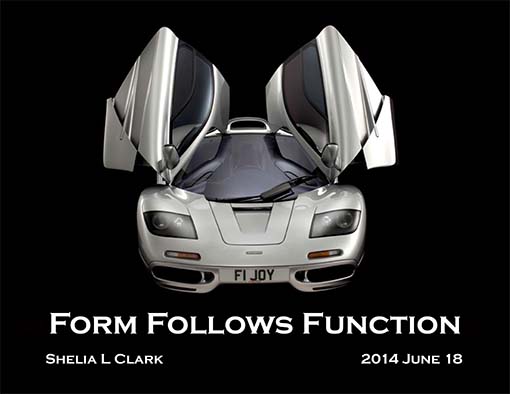
THE Cardinal Rule of Design in any discipline is Form Follows Function. This holds as true - if not moreso - for web design.
Form is how function gets implemented. It's how a visitor navigates a website to find the content they're looking for. A utilitarian website such as Google keeps things clean and simple so as to not interfere with its function as a search engine. Load a site down with stuff that looks good but doesn't contribute to a visitor's experience and you've got a load of kitsch which will cause visitors to leave before even finding out what content you have to offer.
What follows are ten examples of websites which are exceptional in their use of form to support their function.
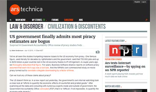
As a news source on the technology front, this site uses a clean straightforward design. The site's landing page mimics the format of index pages used by print magazines, providing fast and convenient access to recent and leading articles while a prominent breadcrumb, clean fly-out menus, and sidebar organization aid visitors in locating other content of probable interest.
Ancillary content, such as visitor comments, is ‘tucked away’ until specifically requested by a visitor via the speech-bubble icon. Referenced articles are linked in the text itself and quotes are clearly yet subtly indicated so as to put as little as possible between visitors and their desired content.
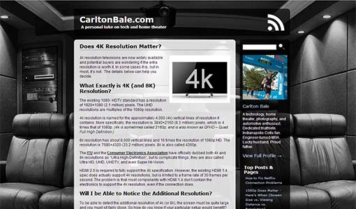
Carlton Bale is a former electronics engineer whose blog examines prominent topics about consumer technology and translates the facts from techo-jargon into plain English. His prominent focus on home theater systems is reflected in both the monochromatic color scheme and the background image.
While his articles tend to be somewhat lengthy, he uses descriptive subheadings which enable visitors to quickly scan the article to find the portions of greatest interest. Where appropriate, he hotlinks graphs which visitors can view in greater detail if interested.
Sidebar content includes a brief “about the author”, links to other articles on his site (organized by popularity), a small sidebar ad (for modest revenue), and a Twitter feed. An RSS subscription is also available via the icon in the top right corner.
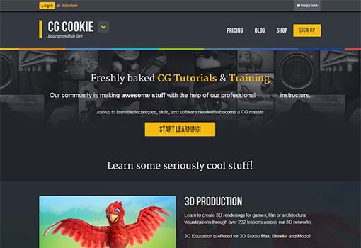
What began as a series of independent tutorial websites (BlenderCookie.com, UnityCookie.com, etc) consolidated under the commonality of their computer-generated theme. Their focus on video tutorials and keeping pace with advancing technology is what resulted in design free of clutter and easily accessible via mobile devices such as tablets, smartphones, and other touchscreen devices.
This emphasis on mobile accessibility follows throughout every element of the site’s design. The darker background both minimizes battery drain on such devices and makes the brighter colors of the actual content stand out with prominent contrast. Additional navigational options are available via the inverted caret icon, staying tucked neatly way until the user wants them.
Showcasing amateur CG artistry, the key feature of the main page is the collage lightbox which highlights recent uploads. Hovering over one of the small thumbnails brings up a larger thumbnail, and clicking on either brings up the full image.
Below this area are the featured CG workshops which are the site’s real bread-and-butter. This site makes no bones about its primary function as an educational resource — leading with examples of awesome CG imagery to set the stage for the course offerings which can teach you how to create such imagery yourself.
The sidebar highlights recent features and articles as well as recent news from the CG industry and feeds from Twitter and Facebook. The main navigation bar is simple, clean, and subtle — nice contrast, but nothing overpowering. Whether top-to-bottom or left-to-right, the site’s design inevitably draws visitors towards the educational workshops and webinars they host.
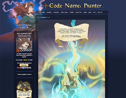
The latest publicly-available (ie free) page of the comic takes center stage, along with standard navigational options along with comments by both the artist and visitors. The background features a splash image from a recent issue, but is otherwise a dark solid color, while the main navigation bar is clean and completely free of useless clutter.
The sidebar features a donation promotion, the artist’s Twitter feed, snail-mail contact info, update schedule, and — keeping with Darc’s twisted sense of humor — a “Slacker Tracker” to keep visitors apprised of how well she’s keeping to her update schedule (or not).
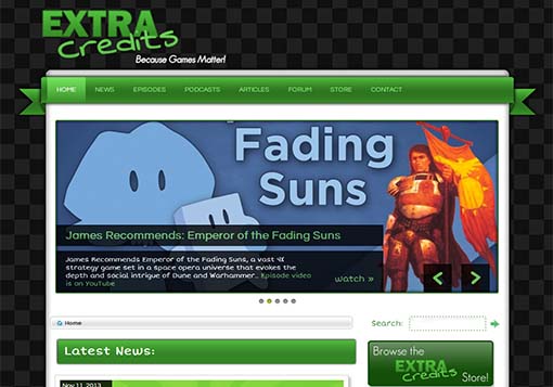
Taking its name from the infamous debacle with Team Bondi and L.A.Noir — where the producer maliciously excluded people from the game’s credits, prompting employees to create a web site to make sure that everyone received proper credit for their contributions — this is a site dedicated to video games. What makes a bad game bad, what makes a good game good, how they’re created, and ways in which games can benefit society beyond mere recreation.
The clean menu design offers easy navigation, while the simple banner highlights the most recent episodes of the YouTube videos which are the cornerstone of site’s emphasis. The ‘news feed’ highlights the most recent major announcements, while the sidebar focuses on game-related sources of revenue to help keep the show and its web site funded.
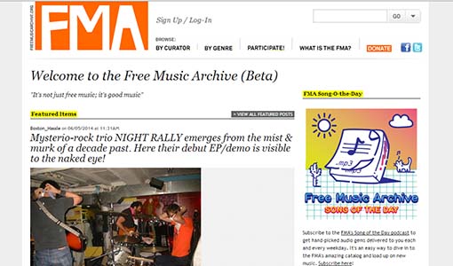
Favoring the utilitarian end of the spectrum, this site’s main function is to feature the works of independent musicians. The navigational menus are simple and straightforward, with most of the emphasis placed on the content itself.
Visitors can browse through more than 100,000 audio tracks by nearly 13,000 artists, organized by dozens of genres and sub-genres. The most prominent feature throughout is enabling visitors to ‘hotsample’ and download audio tracks from anywhere in the site and to navigate to all of that creator’s content with a single click.
Each artist’s page features all their audio tracks, organized by album/collection, usually accompanied by links to their offerings on pay services such as iTunes so visitors can readily pay these artists for their works. Additionally, visitors can link up to the artists’ social media and leave comments concerning their works.
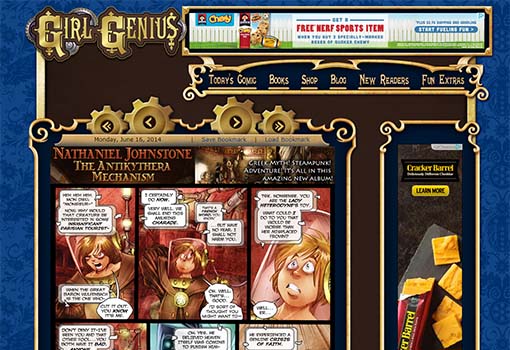
Girl Genius is the work of Professors Phil & Kaja Foglio and is largely considered the origin of the SteamPunk genre. From the Victorian-themed background wallpaper to the ornate scrollwork of the CSS containers to the navigational gears to the brass color scheme used throughout — everything centers upon and reinforces the SteamPunk aesthetic.
The comic itself, of course, takes center stage, while the primary navigation options at the top are limited to those most directly related to the ongoing saga of Miss Agatha Heterodyne, the titular Girl Genius. The banner ads which help fund the site are tastefully integrated into the design, while the sidebar also invites visitors to contribute to the Foglios’ work directly.
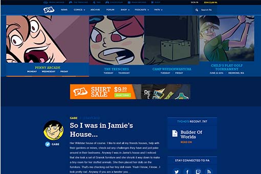
Part webcomic-hosting site, part blog, part video-hosting site, and all tongue-in-cheek social commentary, this site is a network hub of diverse perspectives on topics relating to technology and video games.
The clean navigational design features drop-down menus for direct access to different parts of the site, while the banner highlights featured comics and articles. The ‘feed’ column lists recent blog entries while the sidebar offers easy access to social media and subscribing to the site’s newsletter.
As with other sites, the popularity of access via mobile devices has led to a design which offers convenient access on smaller touch-driven devices without sacrificing usability for computer-based visitors.
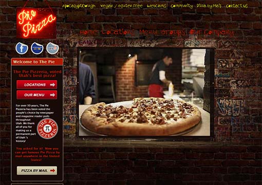
This local pizzeria features a graffiti-laden brick wall as its background to emphasize both its old-fashioned approach to making pizzas and the casual environment promoted by the actual restaurant. This is further reinforced by the scrawling ‘hand-written’ typeface used by the navigational menu.
The landing page utilizes a basic slideshow to feature images of their pizzas and the young college-going clientele to which they cater. Social media links are more prominently featured as they are more valued to their target demographic, and they even feature live webcams to help promote their restaurants as places for socializing among trendy pizza lovers.